Well I had a long think about my set design, and at first I decided that I wanted someone else to do my set design. However, after a longer think I decided to grit my teeth and carry on with it, mainly because I wanted to get past my own block when it came to this area.
So to start off, I decided to do a mood board using my own designs and research that I'd collected, to get an idea of what I wanted and how close I was to getting there. Also, I used this as a chance to compare the colour scheme I was using to the usual colour scheme associated with the type of set I was doing. I primarily looked at old Road Runner Cartoons, and the Lion King.

The main conclusions I drew from the mood board were:
- The colour scheme was off - I was using too much yellow and it made everything look somewhat sickly.
- The thorns I was designing didn't actually look like thorns, or looked too big and unrealistic.
- My cliff faces were too smooth and not rocky enough.
- The level of detail in my designs was minimal, and made the set look bland, flat and unrealistic.
Taking these things on board, I spent several hours playing around on Photoshop, painting up a new set design, still using the design Sarah did for me as a base, and the result was this.
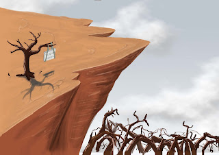 I was pretty happy with this, the thorns look better, more like thorns and more importantly, more threatening. The design is a bit too Warner Bros-esque for my liking, but overall I was happy with the design. One thing that does still need to be changed, however, is the design of the tree. It's still too similar the tree that's being used in Matt Evans film, plus it doesn't quite look dead enough to me.
After this, I did another quick sketch to get an idea of the set from a different angle.
 Despite the drawing being at what can be generously described as a weird angle, I do like this drawing. It has a nice style to it that I find quite cool. I'm also starting to get a better idea from this of what the floor plan of the film is going to be like.
Finally, I began to work out the top and side view, so that I could start thinking about asking Jenn to model the set for me. I'm aiming to be ready to do that by the end of the week.

So overall, Set Design is back on track and going better now. Still not overly happy about it, but am feeling a bit better about it now. Hopefully, it'll all be sorted by the end of the week, so I can focus on particle effects, sound and my final animatic.

 Hello Everybody!


 The Humming Bird required actually very little design, as it came as part of several other designs that I did for background characters. Again, if they featured more prominantly, I would have spent more time on these designs to really refine them.


 And with that, that is all my character design process uploaded. There may be a few things here and there that need to be finalised, and if so I will update, but for now, that stage of production is done.
 Laura also suggested I could do some more alien designs as well. I enjoyed doing this, as it was very free in it's creativity and allowed me to have some very silly fun. Think one of them looks a bit Don Herztfelt-esque now I look at it.